concept & vision
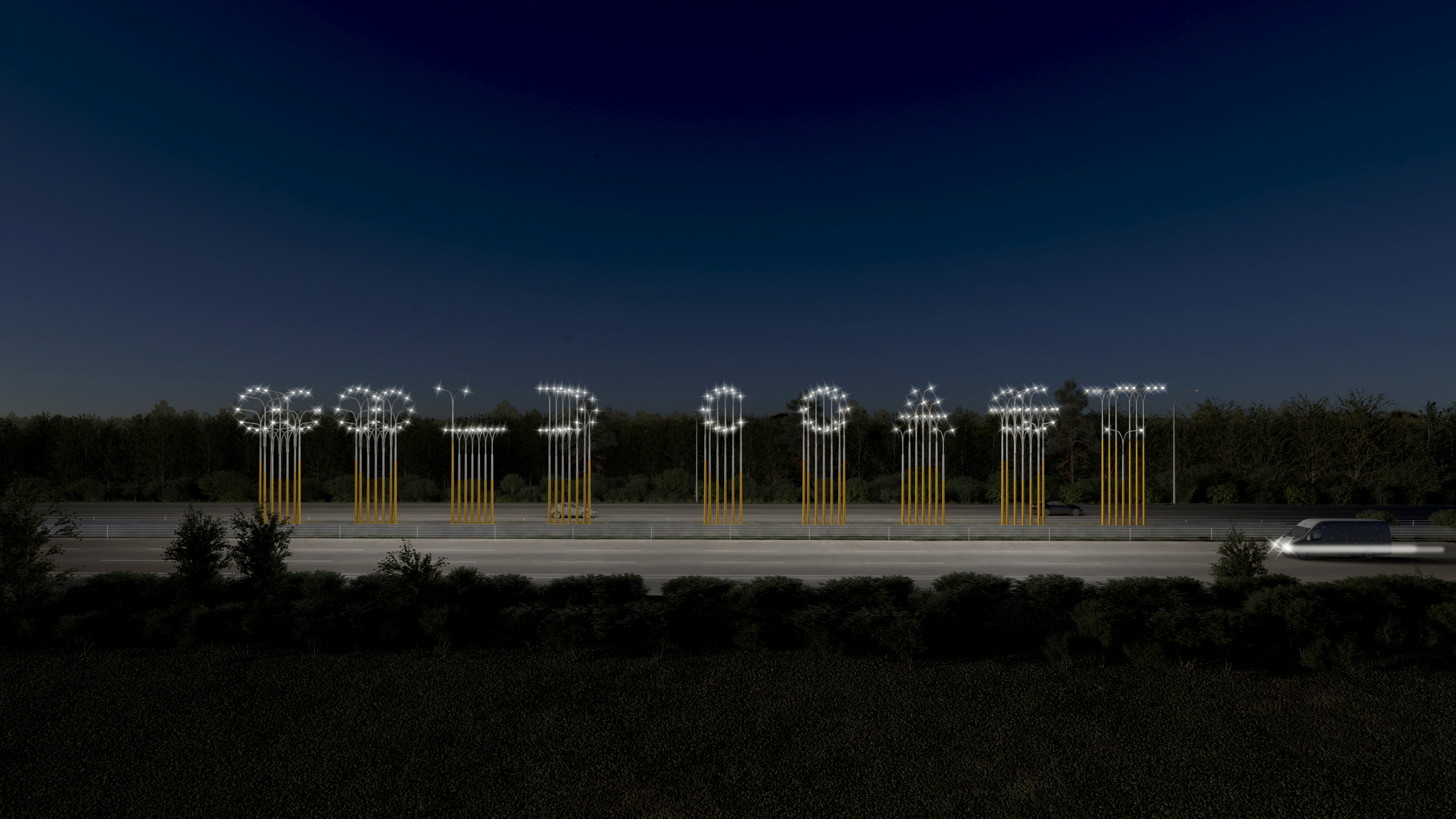
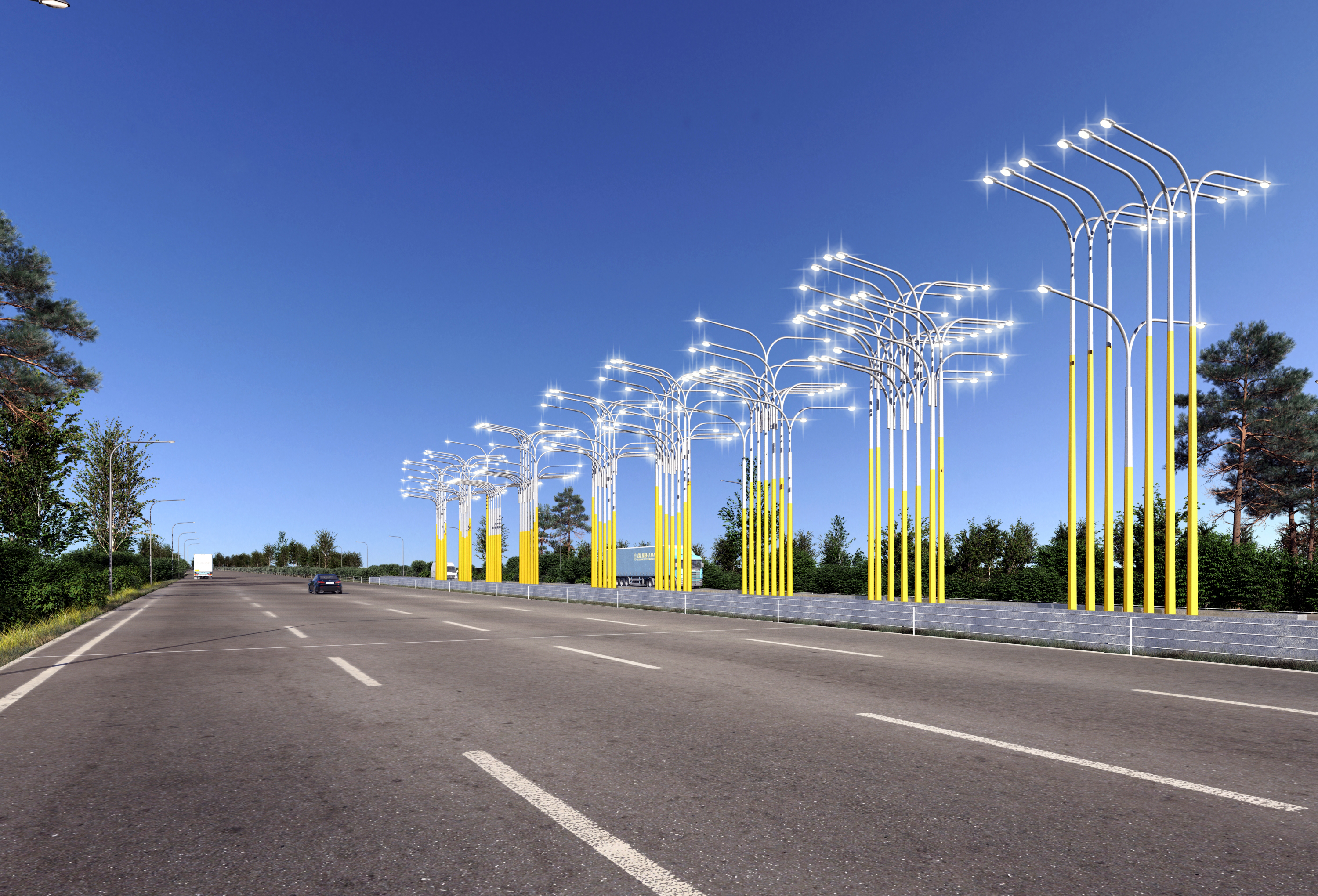
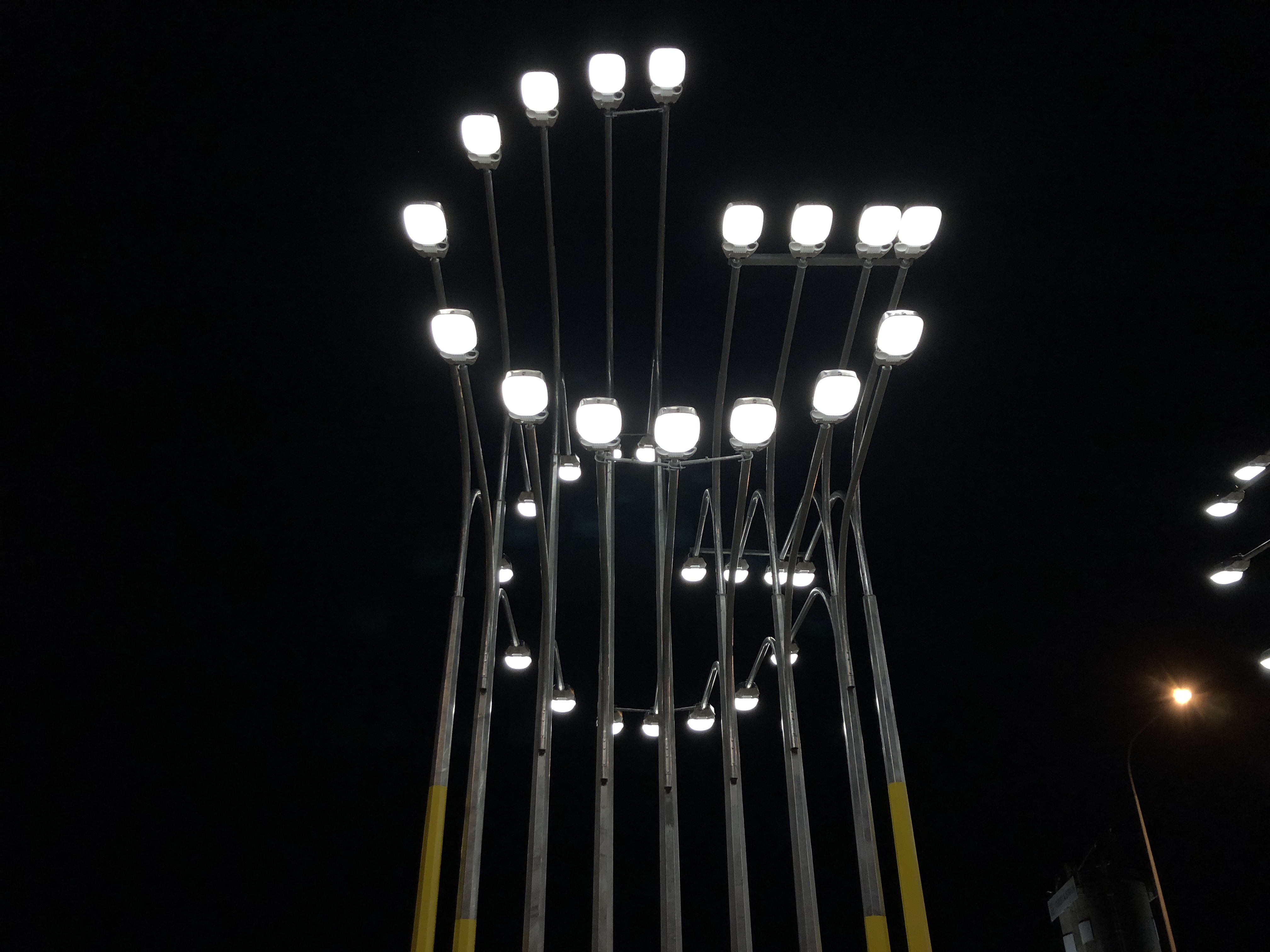
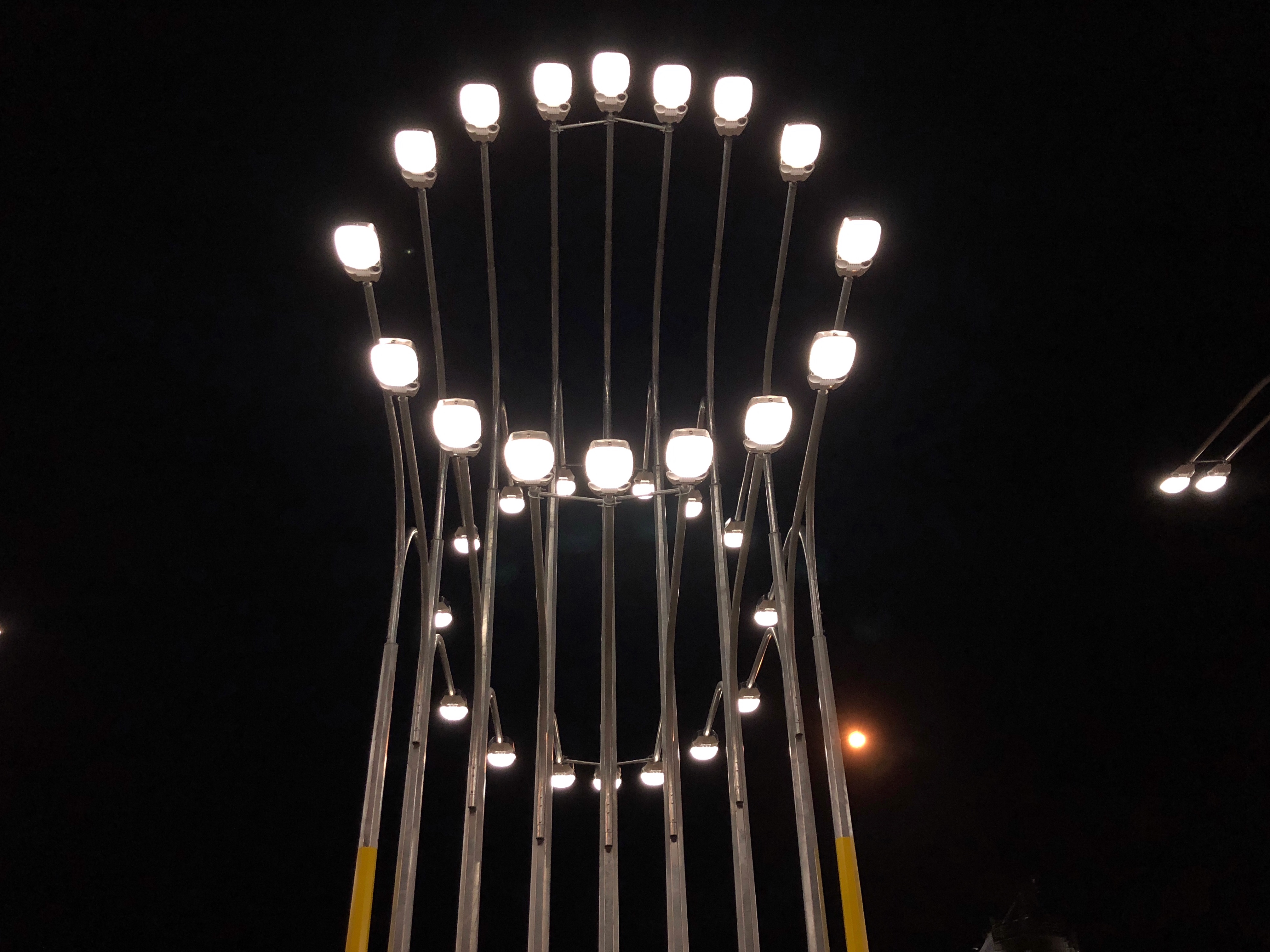
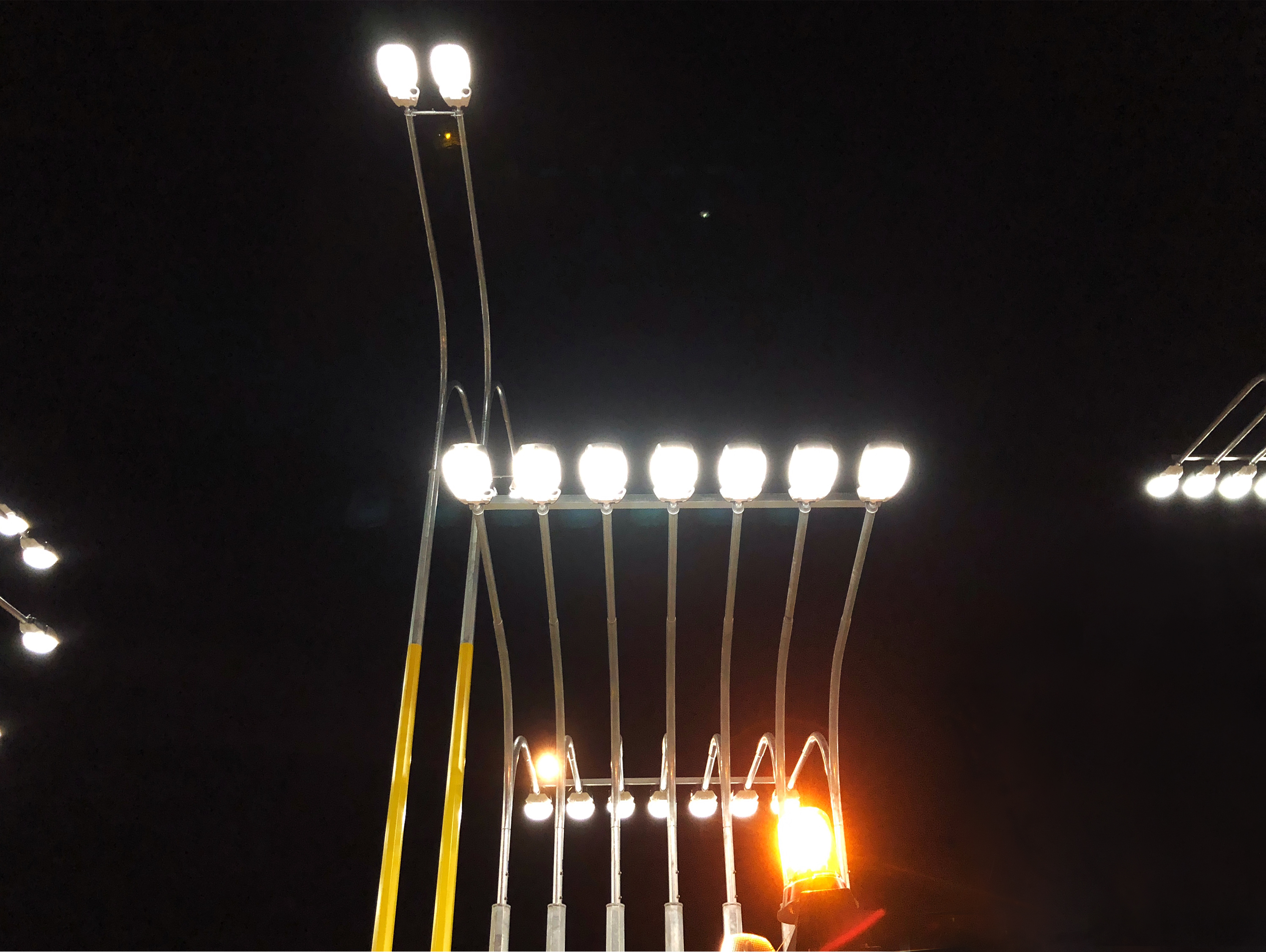
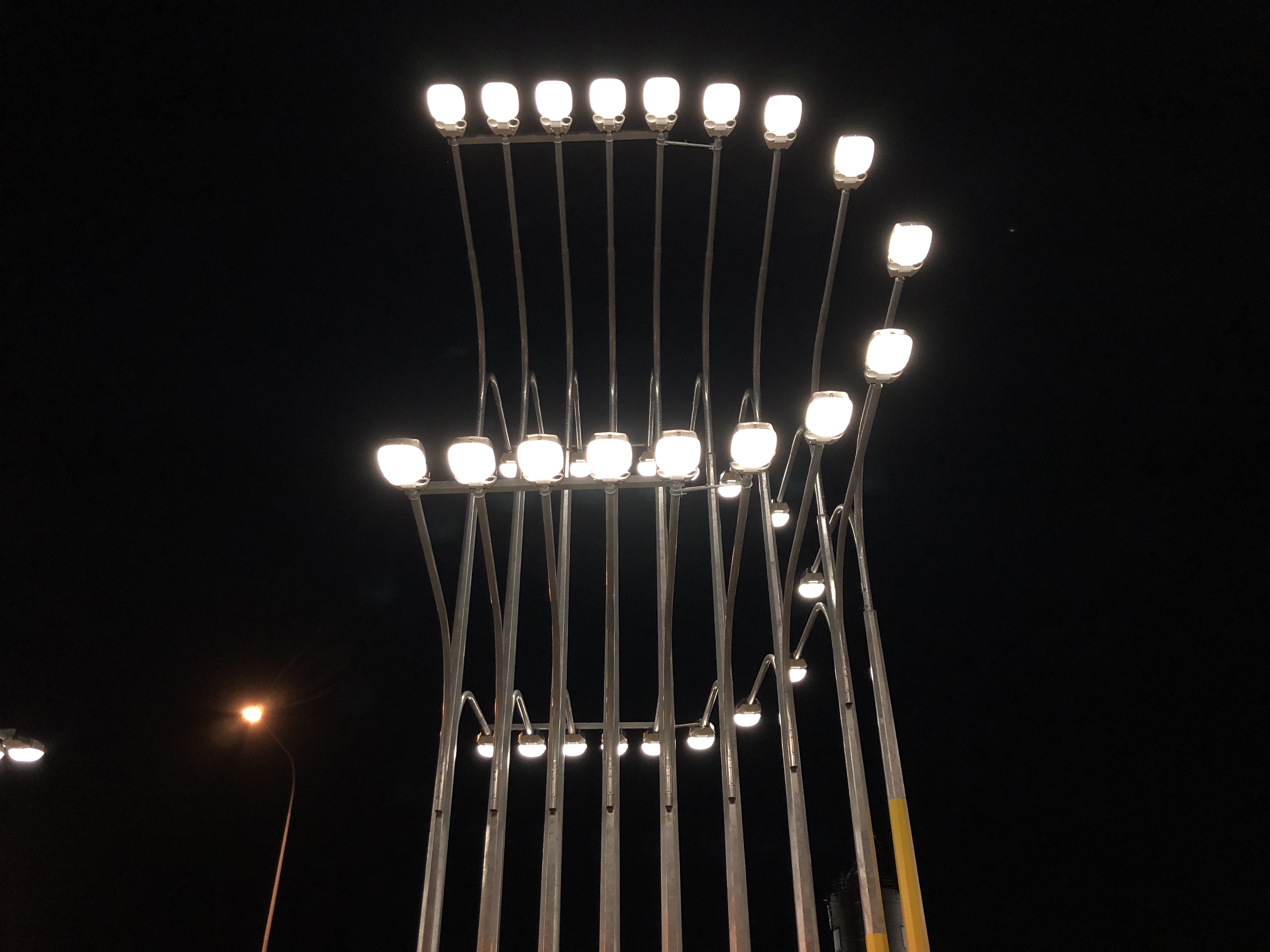
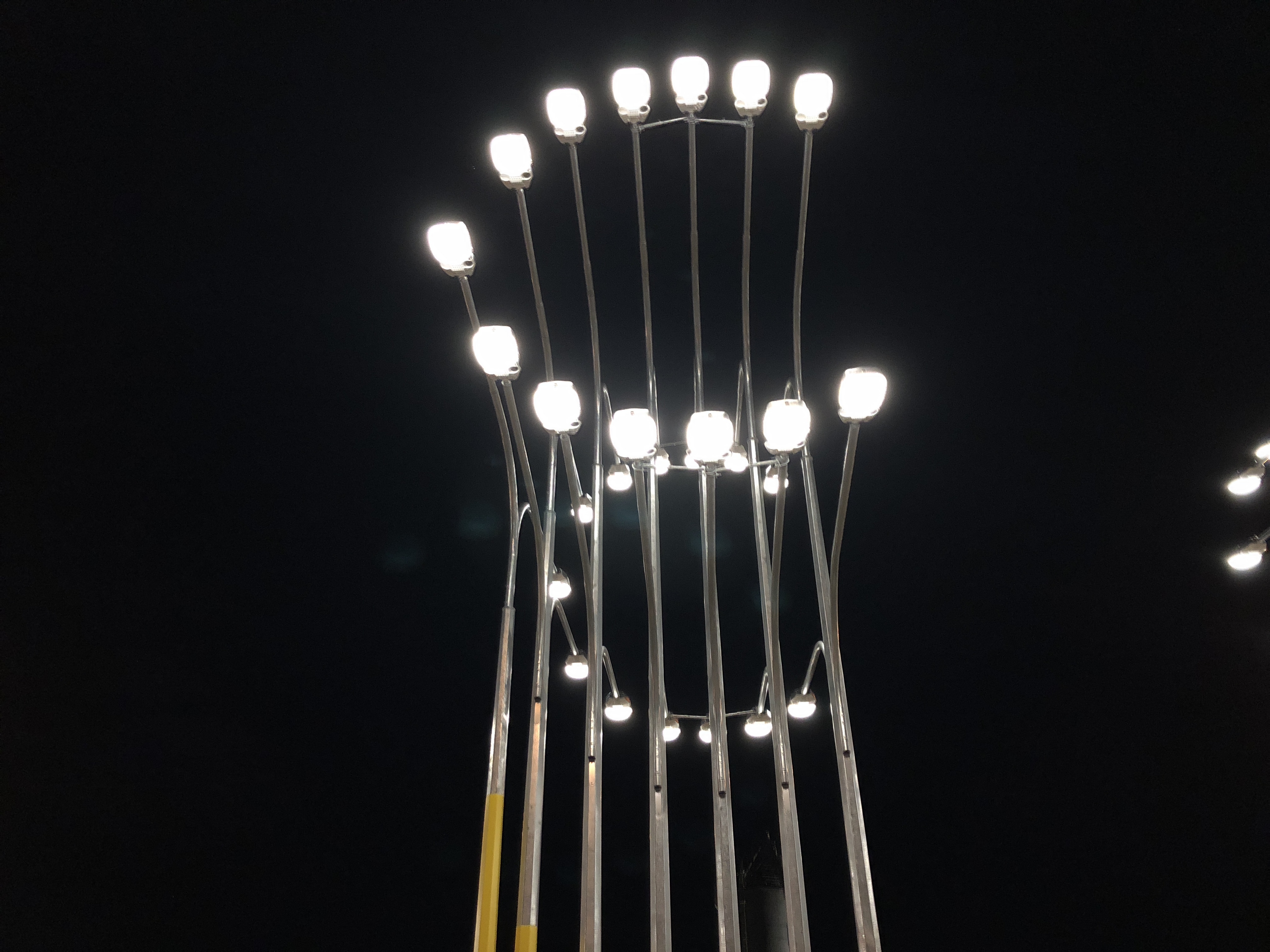
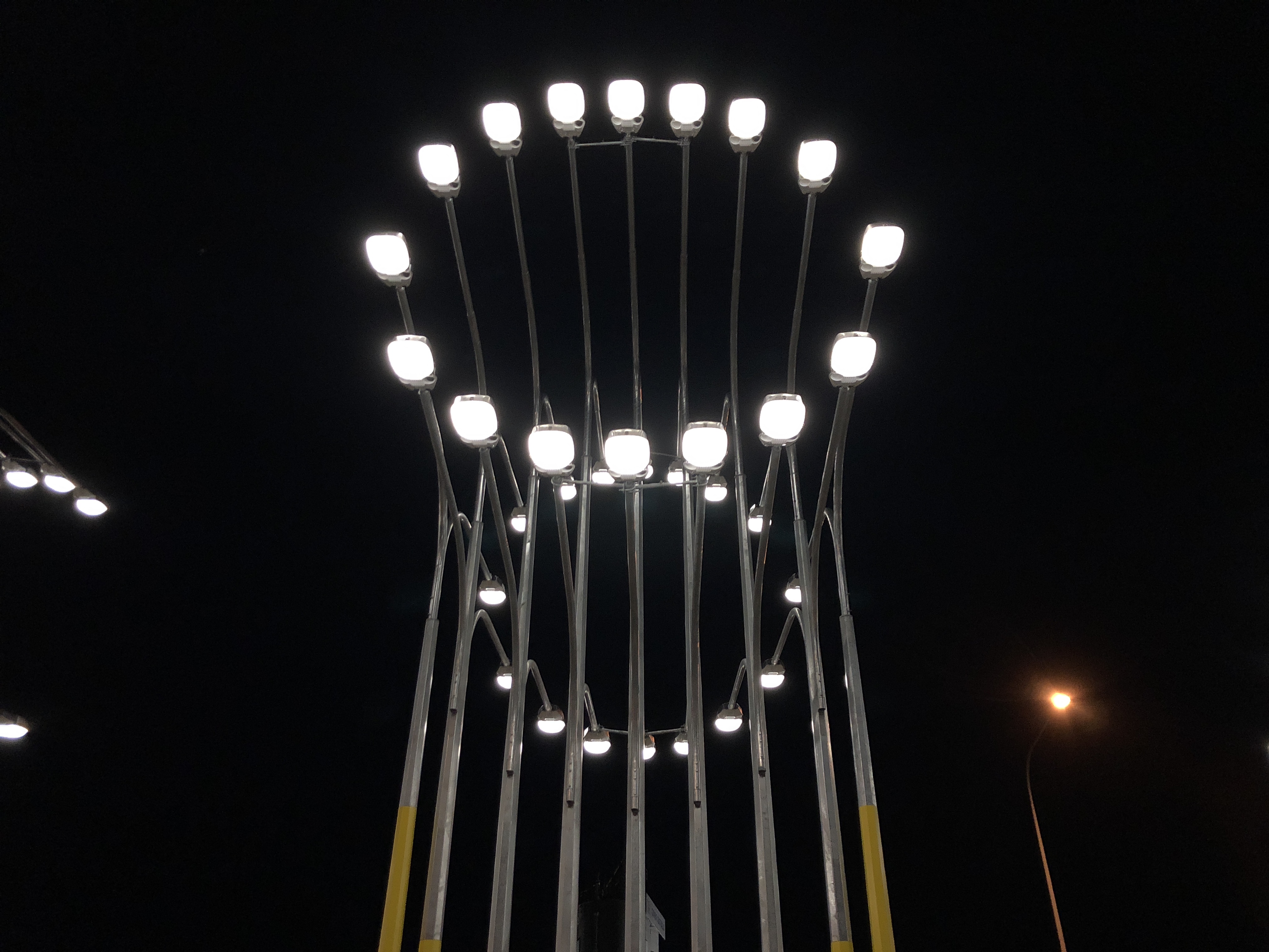
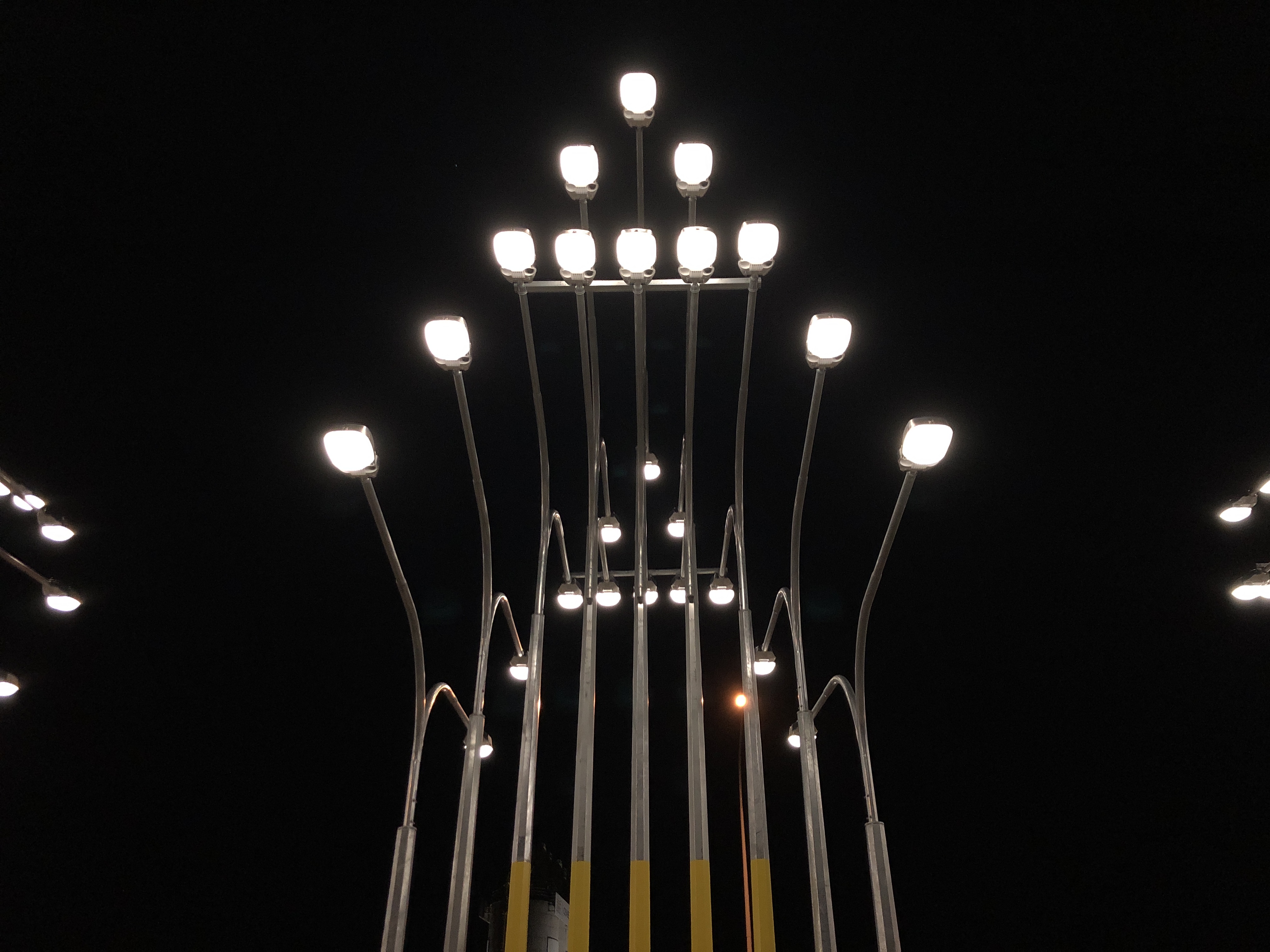
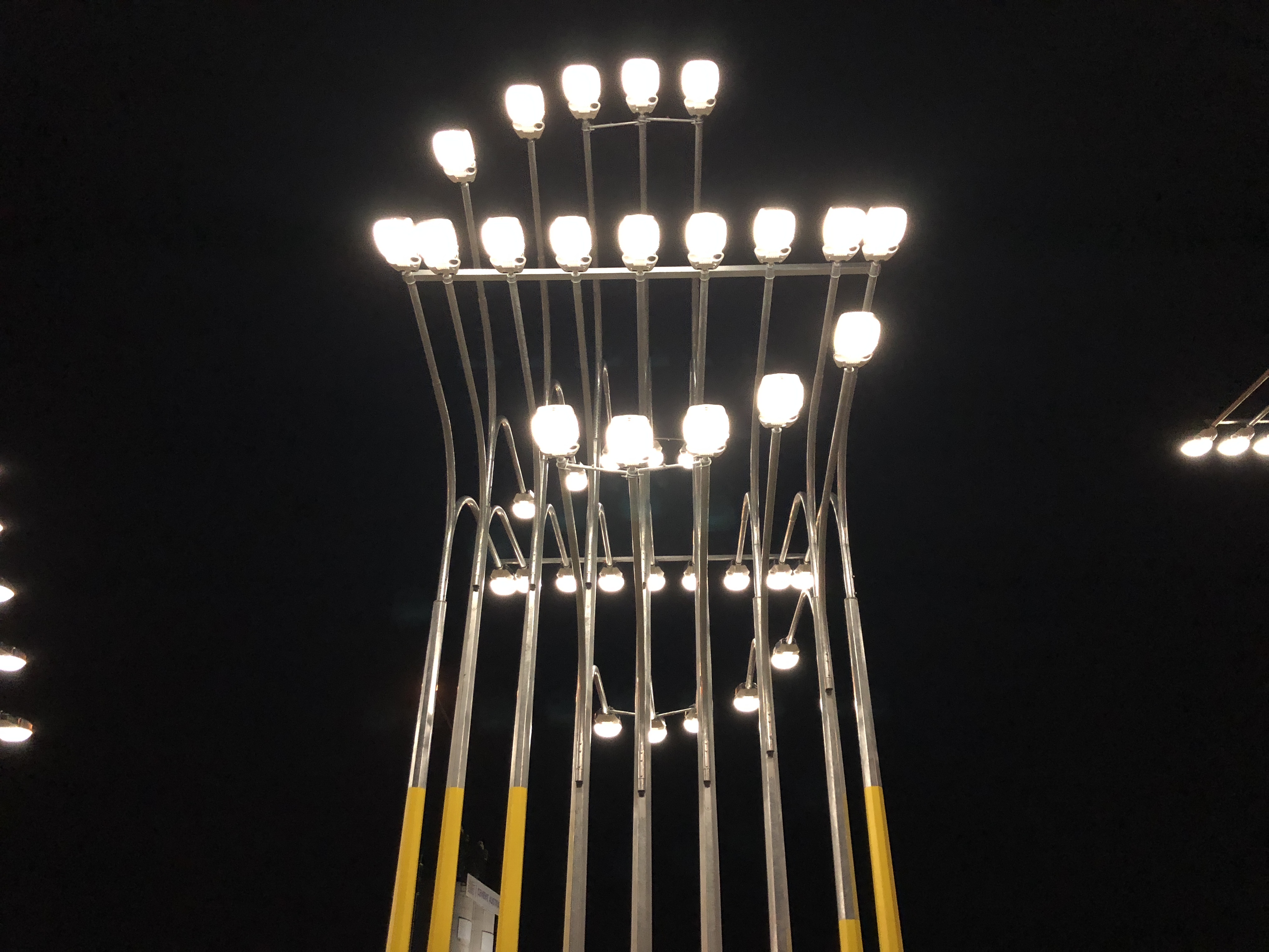
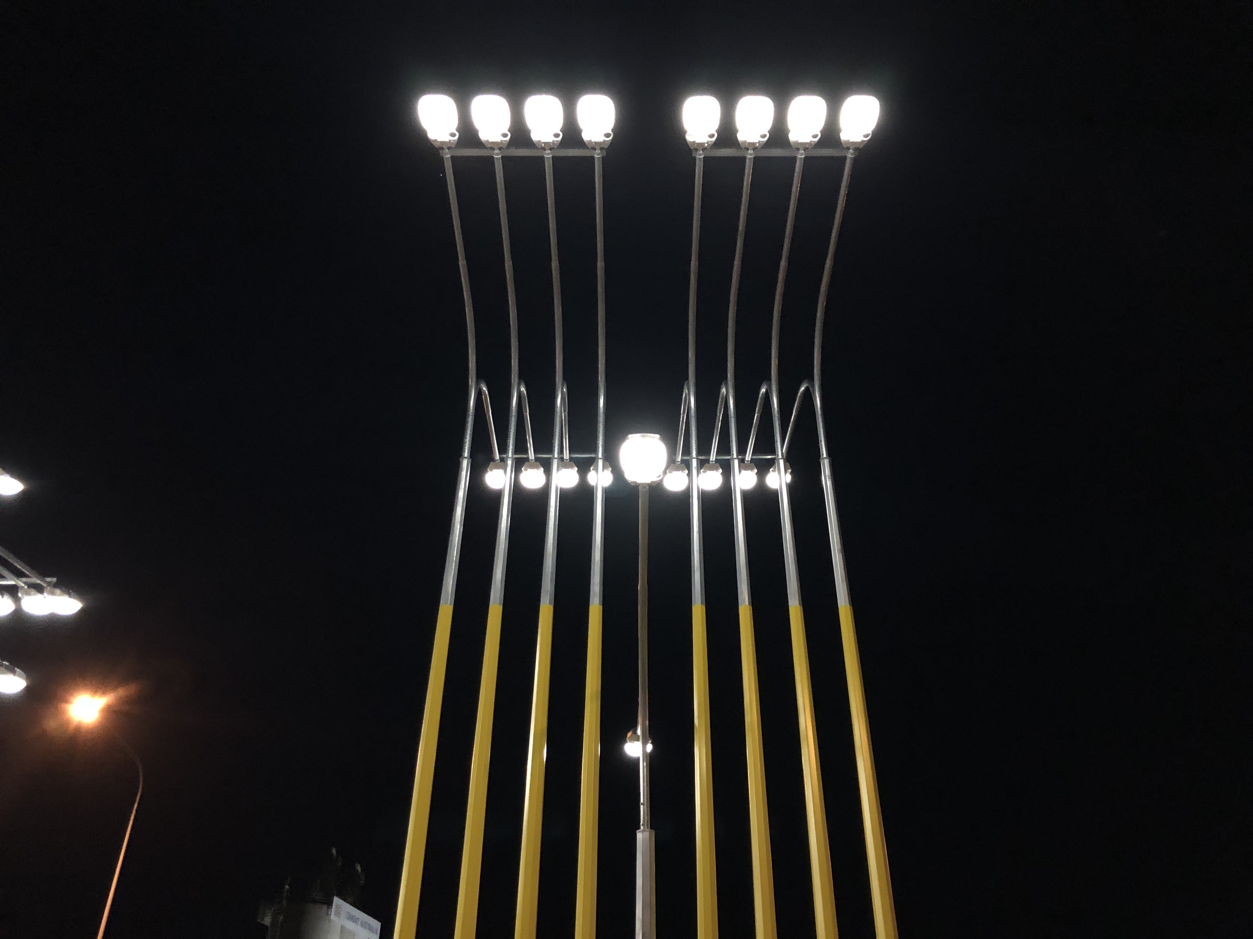
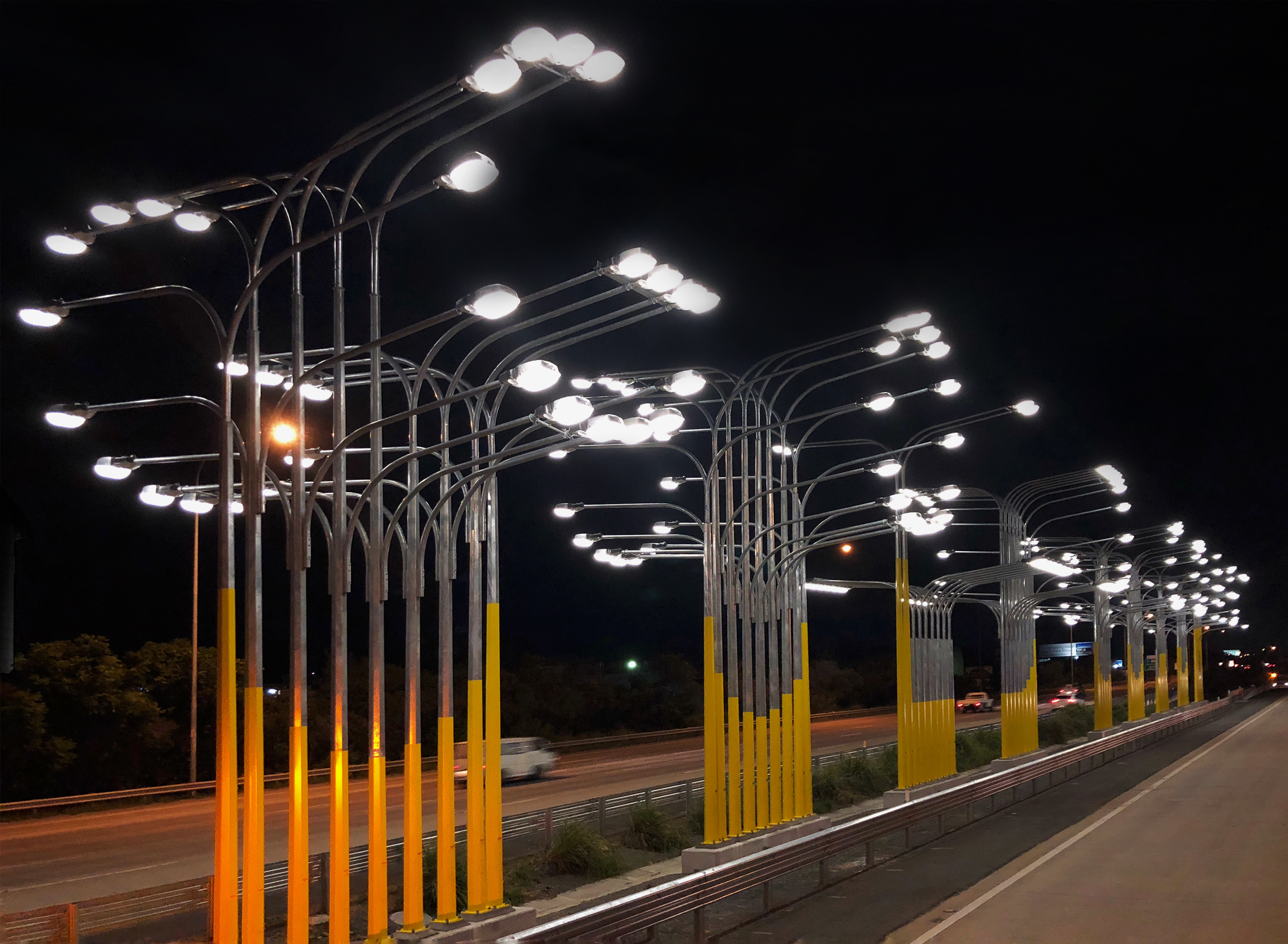
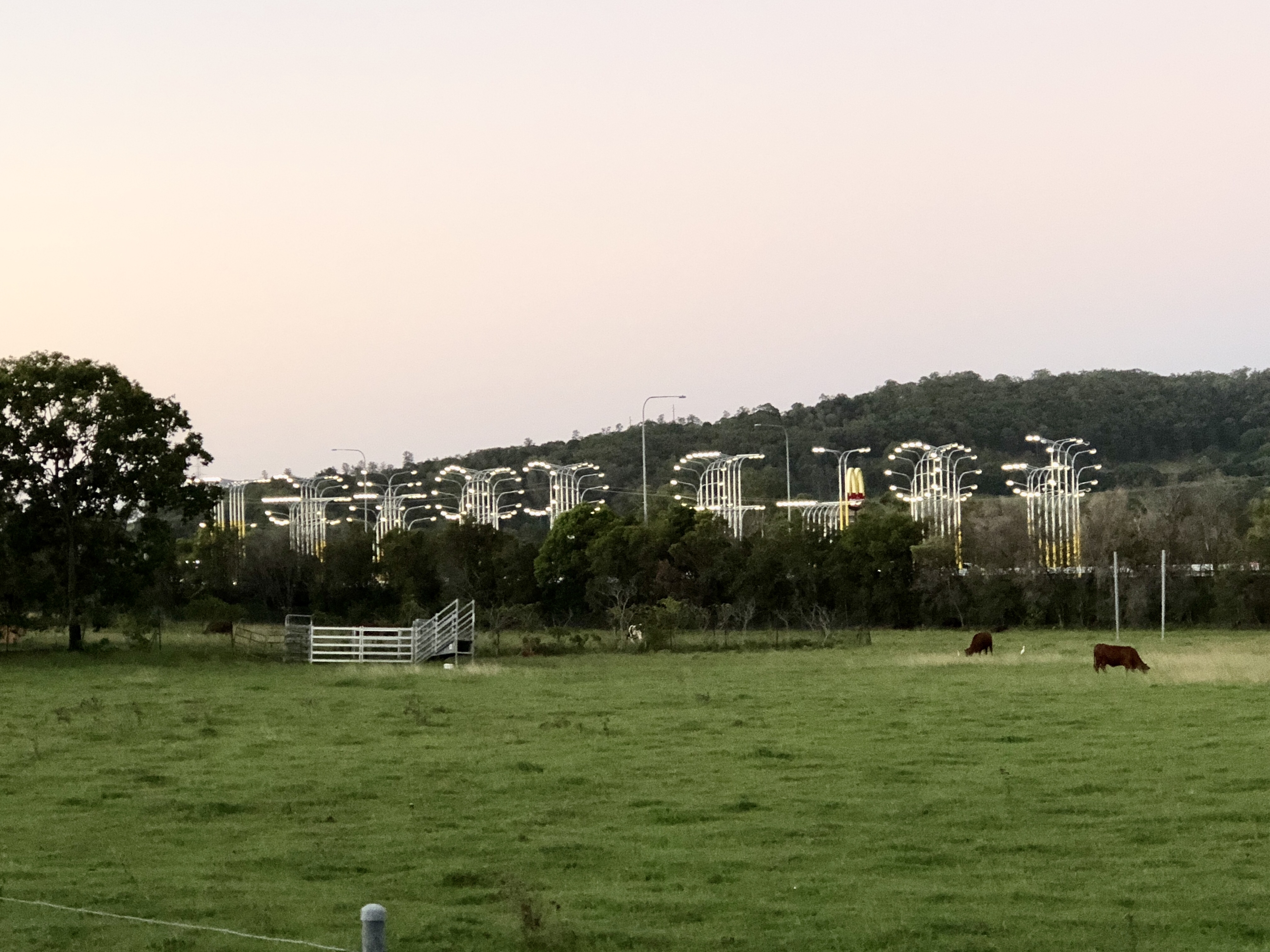
inspired by the north site, a narrow stretch along the median of the Gold Coast Highway, the public artwork is a radical adaptive reuse of seemingly familiar infrastructure - the light poles, cantilever arms, and fixtures to be found all along the highway itself
design & architecture
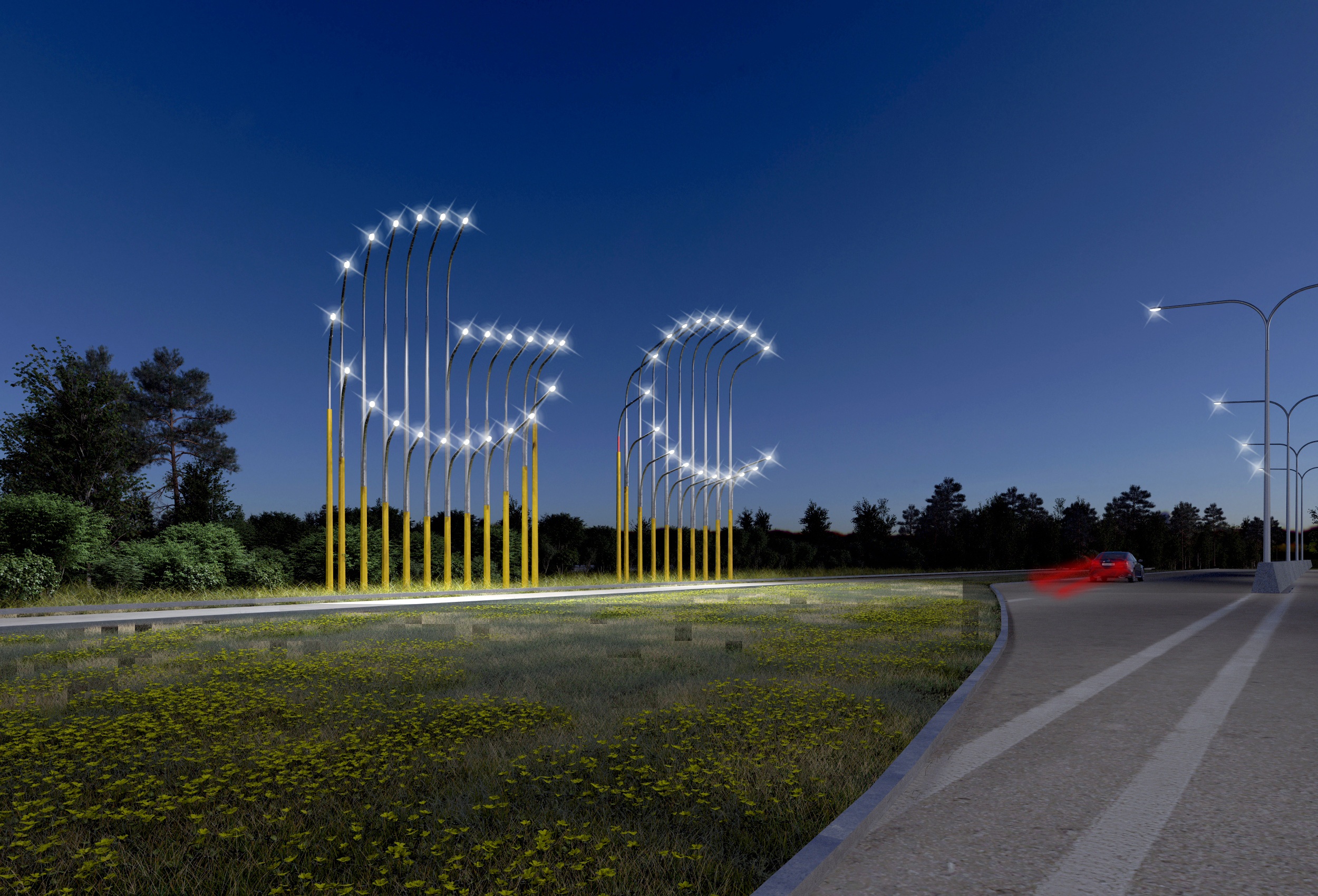
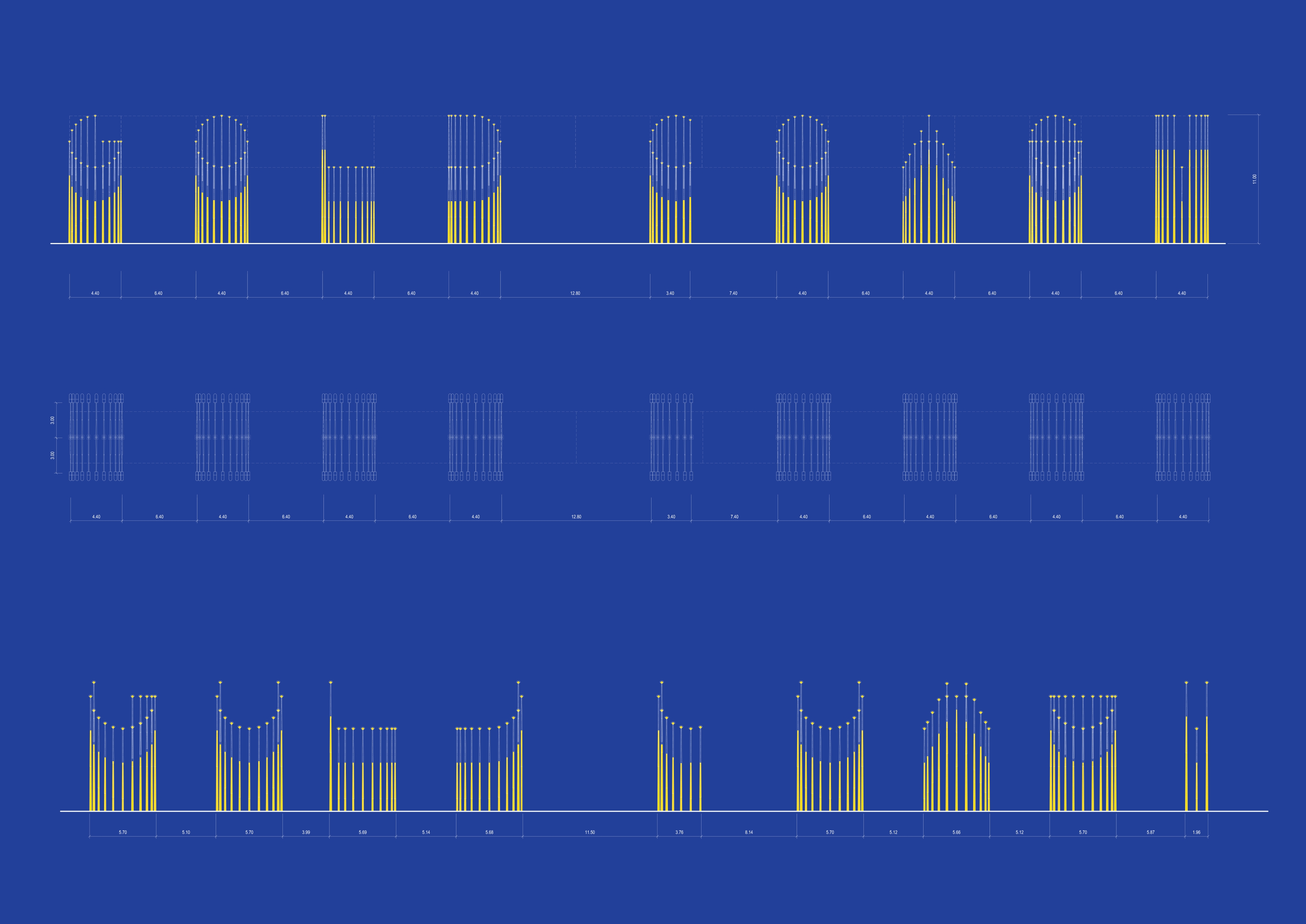
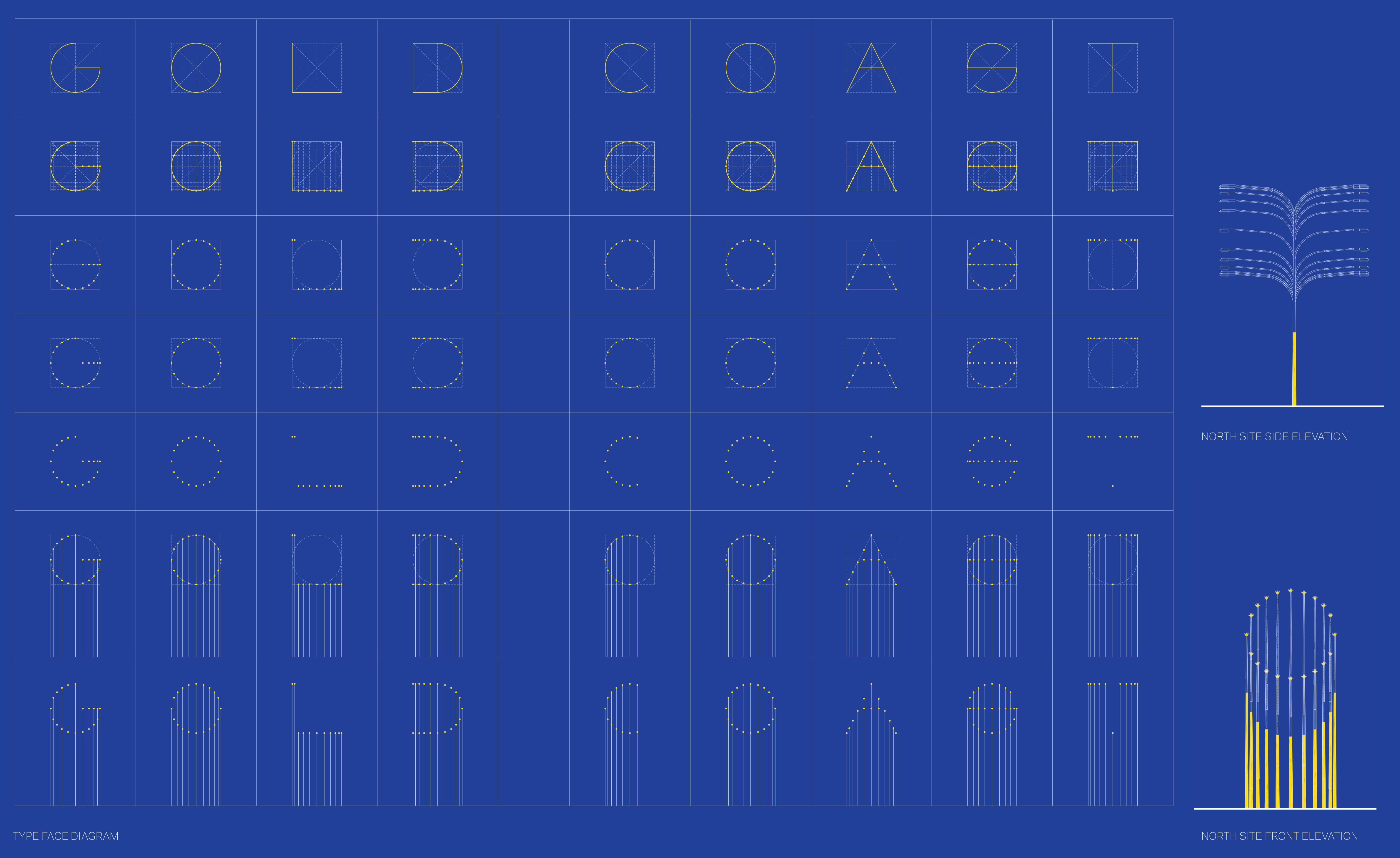
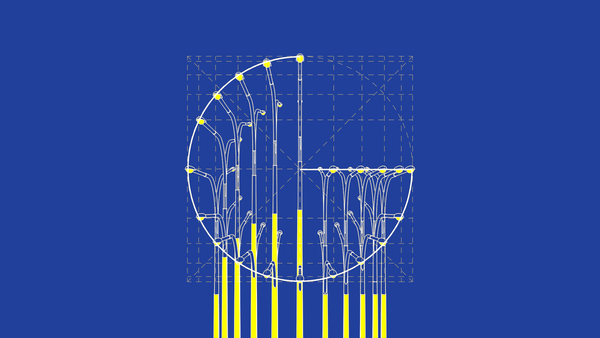
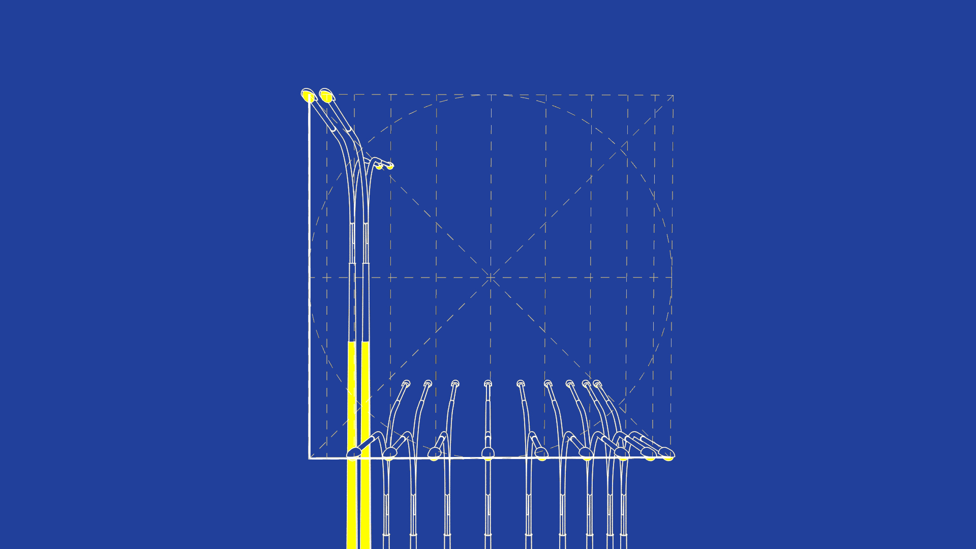
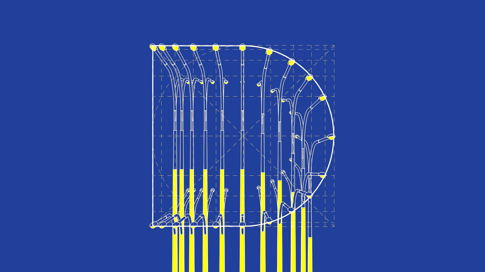
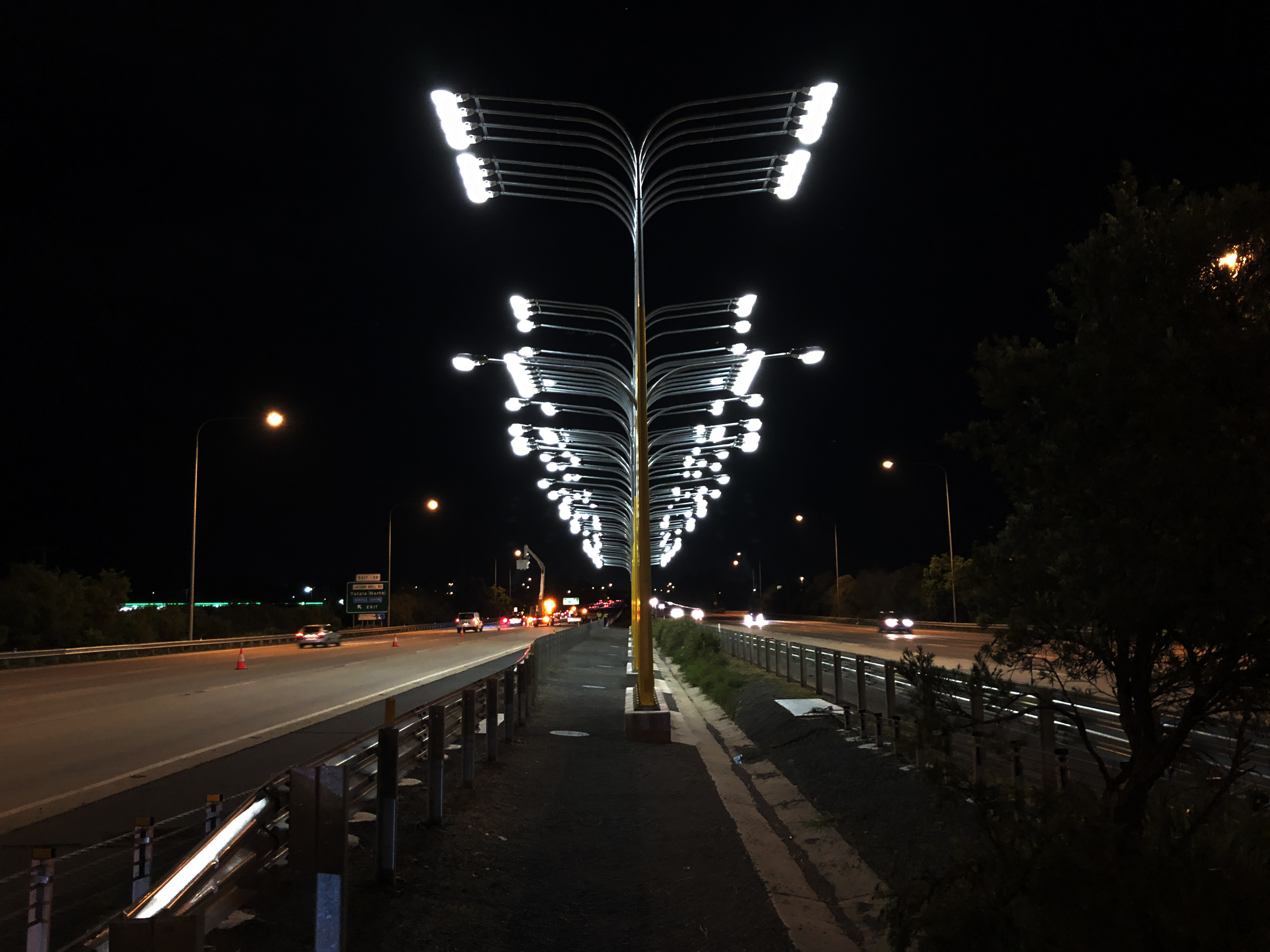
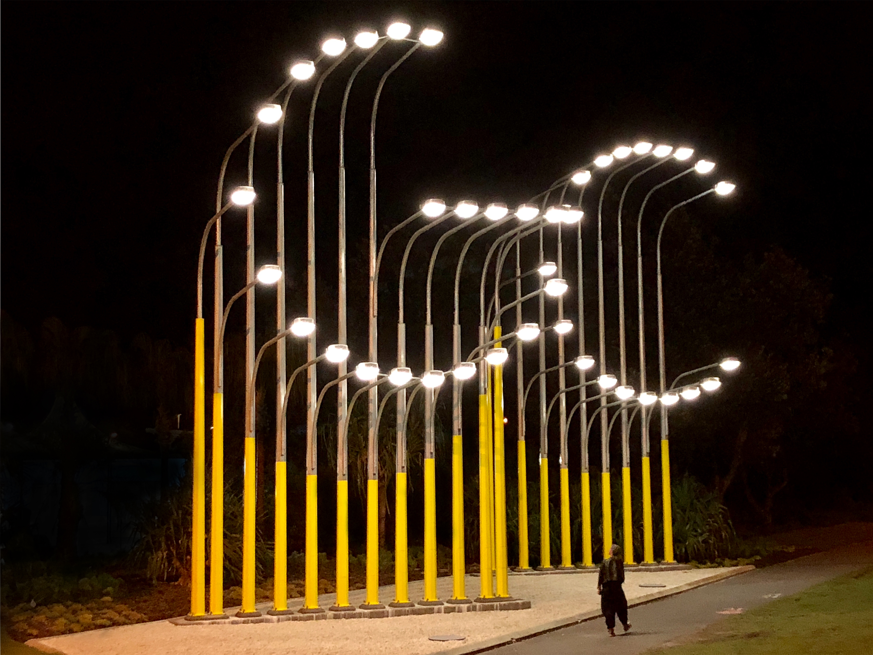
for the Northern site along the highway median strip, the highway lighting fixtures are closely spaced and modified to different heights so that the illuminated points of the fixtures spell out the words GOLD COAST—our “name in lights”. We select double-arm poles and fixtures to illuminate and engage both directions of traffic. For the Southern site, 22 lights simply spell out GC as a bookend of the Northern gateway sign. We locate the larger letterforms at the entry/exit of the Gold Coast airport, framing the arrival by air in a more pedestrian, bike-friendly and accessible landscape
program & use
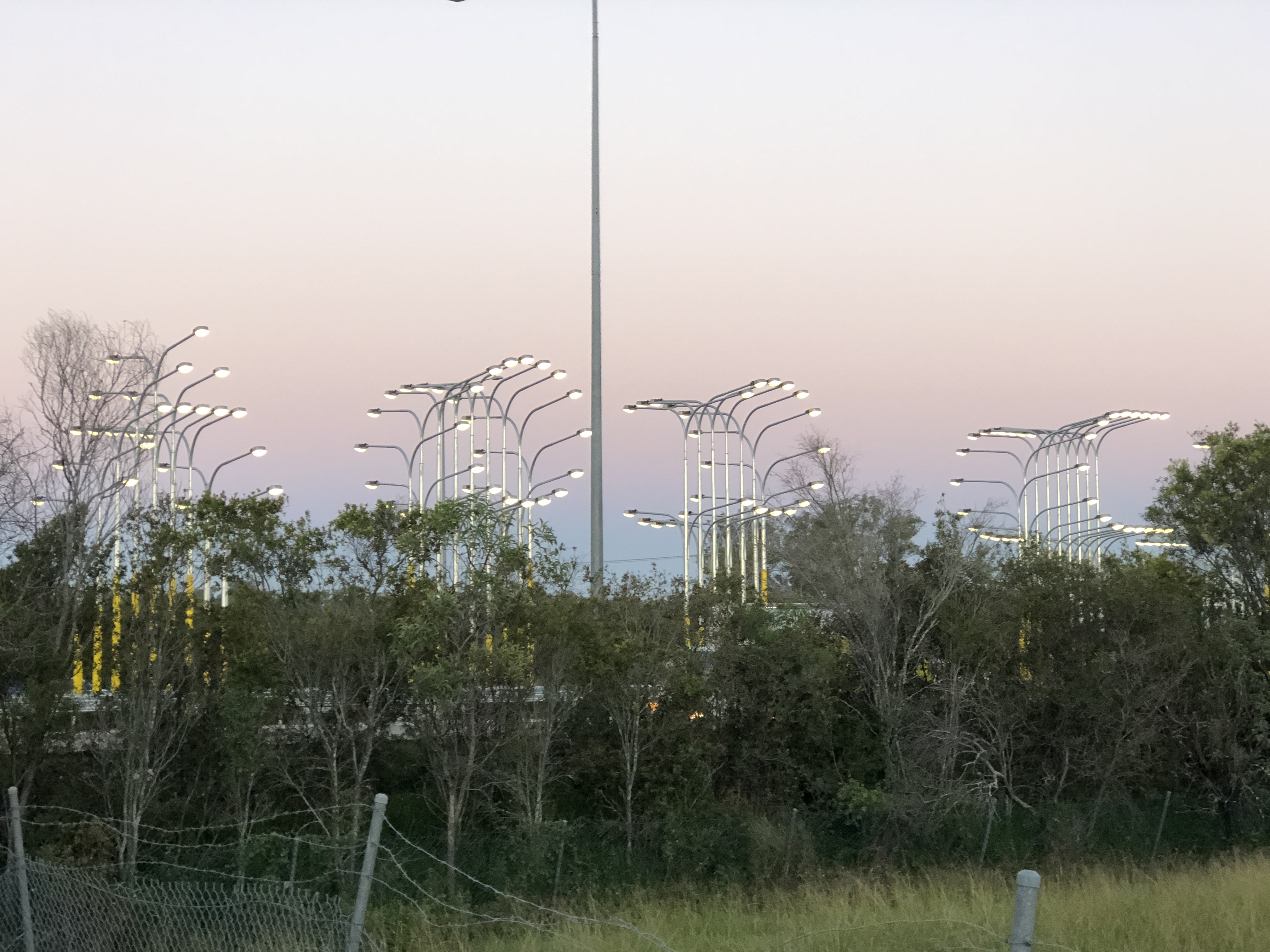
a total of 79 standard poles, at a fixture height from 6.6 to 11.0 meters, map out the letterforms curated to an optimum when seen obliquely and in motion, and to make the most of the available construction envelope. To add a little dazzle during daytime, we coat segments of the silvery galvanized steel of the poles in yellow paint, forming a geometry that echoes and amplifies the rounded letterforms above
impact & significance
we notice this generic highway feature and object, the light pole, that repeats at a consistent distance along the road. We group them so that now one encounters this cluster, a small community – mirrored for the two road directions. It is not a sign, it is more of a verse - letters, words, a cloud. Definitely a marker, an announcement of something changing, something to come – the arrival or departure from this city